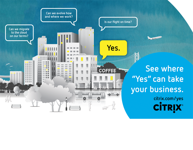
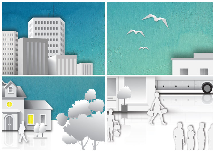


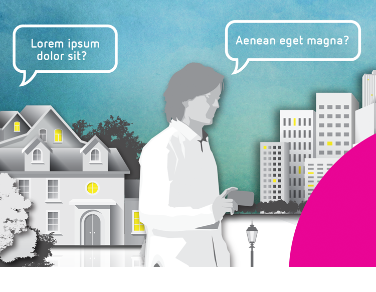
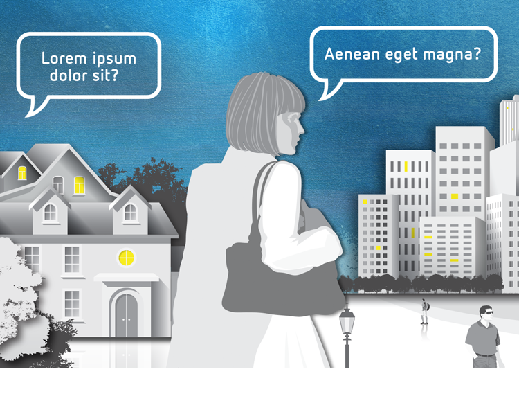
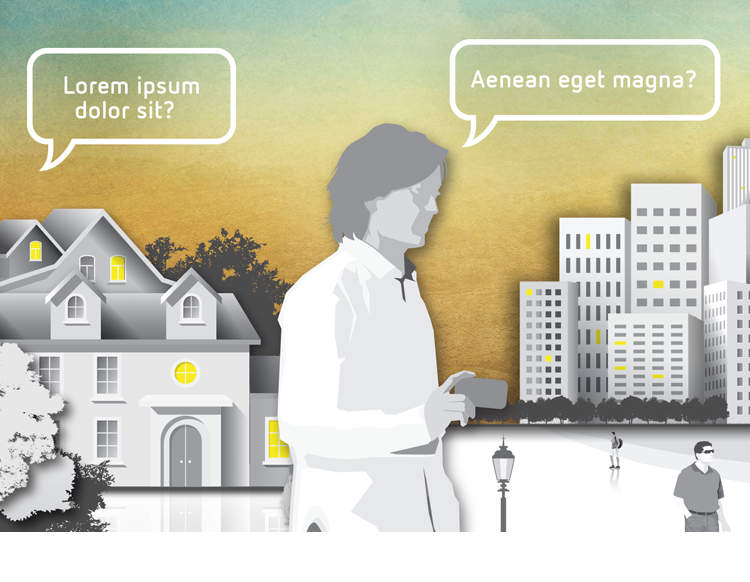
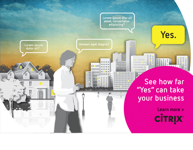
The “Business of Yes,” or “BOY” campaign had a very distinctive look. Characterized by painterly sky textures, flat vector art buildings, foliage and silhouetted people.
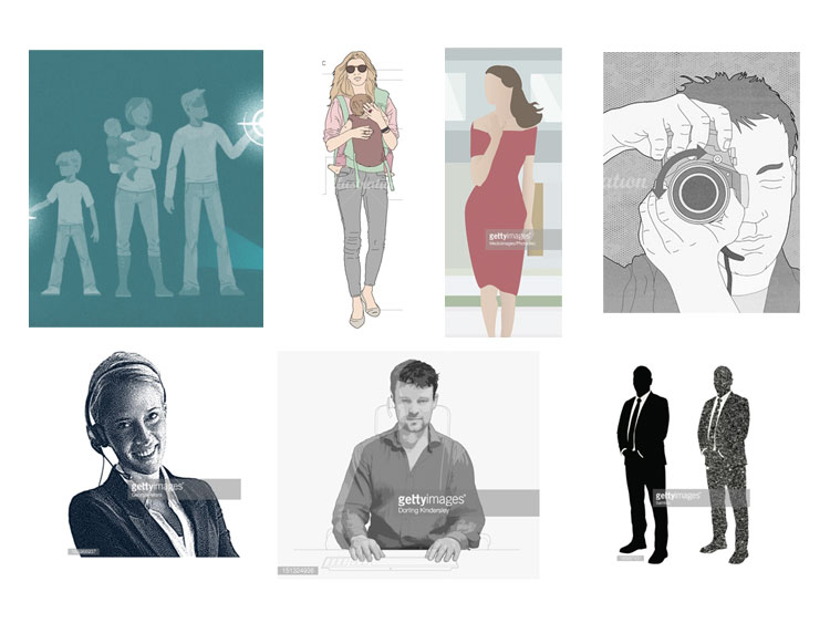
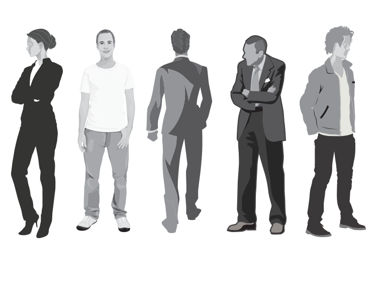
The client had been working with the campaign for a long time and was tired of it. Can we enhance it visually, change it, improve it but not mess with brand recognition? Greg Hawkins at Havas decided to show them the old and the new, side by side before recommending a course of action. I joined the team to explore new looks before we got down to developing the campaign for digital and print. After an exhaustive and considered process (partly shown here) the decision to leave the BOY campaign untouched ruled the day.